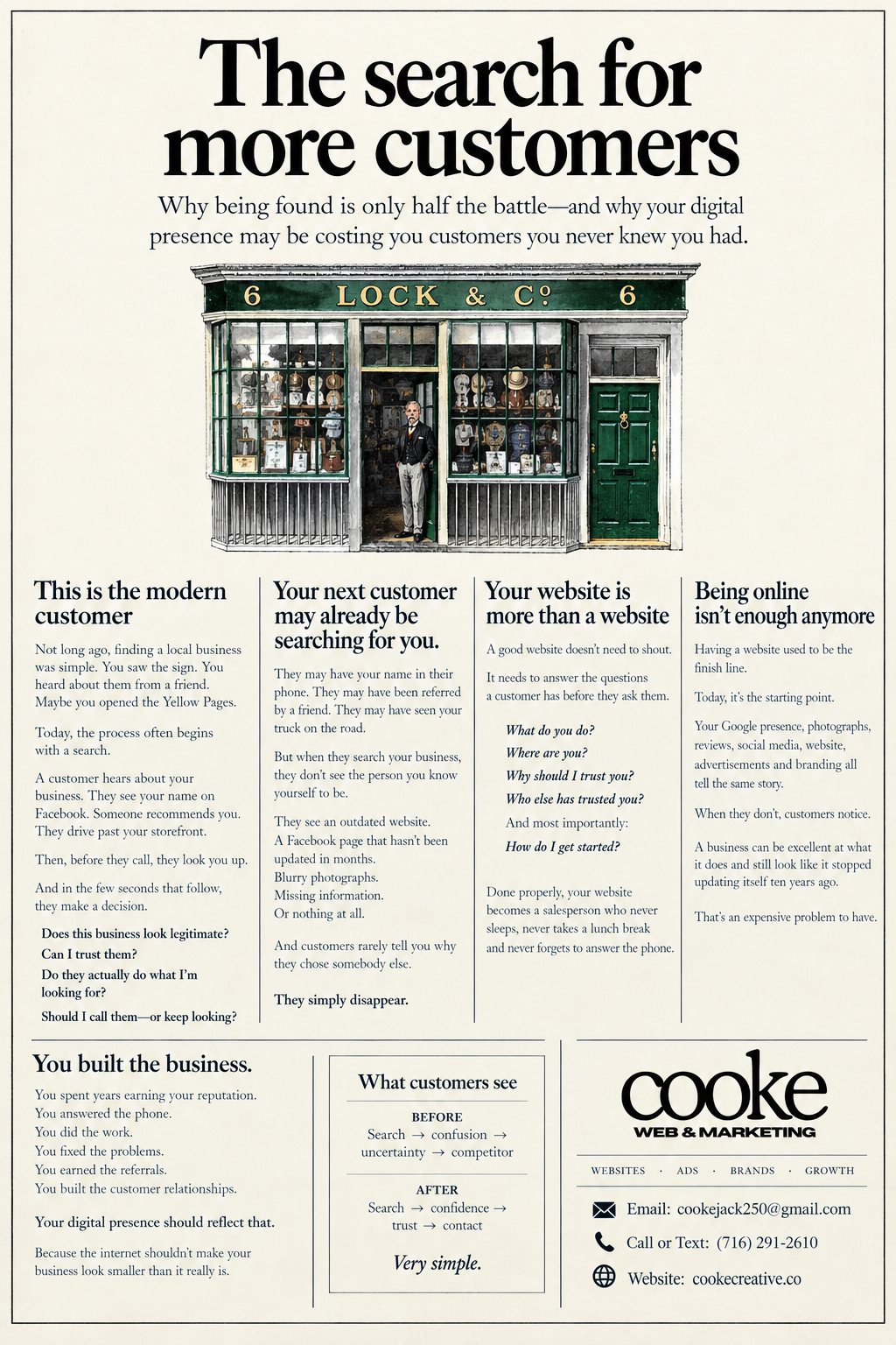
I made this advertisement for Cooke Web & Marketing to be featured in a local newspaper which is run by a non-profit in my town. The design and style was entirely inspired from similar advertisements made by Ogilvy & Mather in the late 1980’s. This ad is a complete throwback. This works because most of the audience reading this magazine were born between 1965 and 1995– this immediately becomes a refreshing sight, a pattern-disruption, and just simply a cool, creative ad. So, attention has been earned. Now let's talk about why exactly this ad gets read, while others get skipped—-It’s because I know certain rules. Rule #1— Always promise a benefit in the headline. By making the headline ‘The search for more customers’, I’m inferring that this article discusses taking the necessary steps to getting more buyers. That is beneficial to a business owner—and business owners happen to be a large percent of the magazine's readers. So, instead of just seeing a typical ‘I do marketing!’ promotion, they’re getting a manifesto on how to get more customers. That is educational to a reader. Give them something. Rule #2— Long copy gets read more than short copy. This one is surprising to hear, but it’s true. If your copy’s long, people assume you have something important to say. That fact can also be paired up with a study which said that this specific layout (large headline at the top, subtext, image, and then columns of writing) gets more readership than others. Rule #3— Always use an image, and always use color. If you’re publishing your own print ads, both of these features will cost more, but the readership and memorability multiplies. If you’re gonna advertise, spend a nice penny.
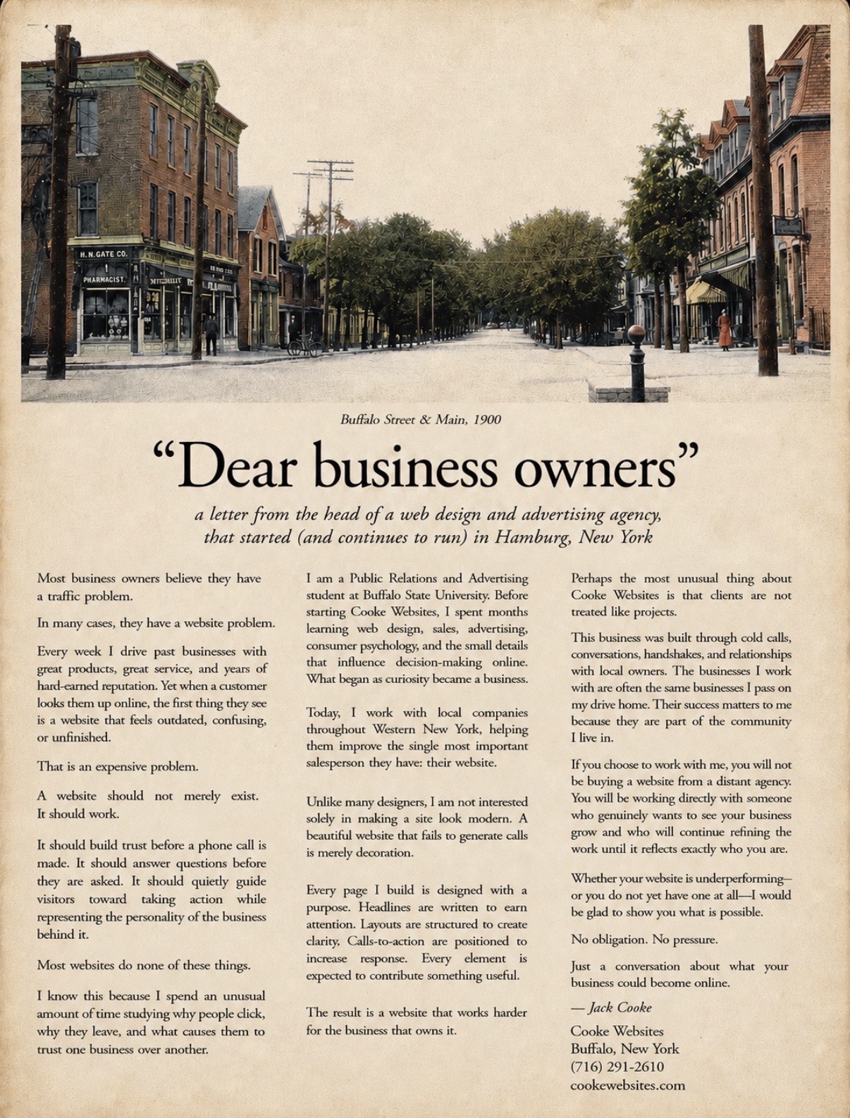
This advertisement has the same backstory as the one attached above, but uses a couple different rules. Rule #1— Always caption photos. Did you know that more people read subtext/captioning under your photo than those who read your body copy? Use it as a second headline if you can. Rule #2— If your headline is in quotations, it captures more attention. Can’t fully explain this one, but it’s been studied, and it’s a true case. If it makes sense, take advantage of it.
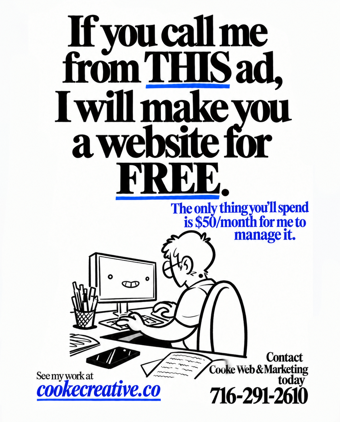
I made this advertisement to post on a couple facebook groups surrounding small businesses and small business owners nearby. Once again, I followed the ‘offer a benefit in your headline’ rule– but this time I used an additional rule that compliments that on nicely, which is: Make your specific advertisement worth something– meaning, attached to it, add a valuable coupon or deal. This creates urgency, and a valid reason to go with your business rather than the other company that advertised the same thing. Add an expiration date–or say, ‘if you come from THIS ad…’ and suddenly they don't want to forget it, and they’re gaining something from engaging with you. Give, give, give.